Don’t Confuse Your Funnel With Reality
May 28, 2014 Industry News, Marketing, Marketing And Advertising Analytics, Optimization, Search Analytics, Web Analytics
Models are supposed to make it easier to see useful patterns, but if you devote enough time to using them you can forget you are looking at a simplified view of reality and not reality itself. The marketing funnel is a great example of how this can happen.

When you are trying get a holistic view of your marketing plan, it is often helpful to segment the audience according to where they are on the path from never having heard of your brand to the end state of buying your product. It can make things clearer. Let’s say you have done some analysis of the buying process for your product and you have found that people move through it like this:
Let’s further say your numbers say that the conversion rates for a given month look like this:
The numbers indicate that once someone is researching your product you have a really good chance of making them a customer. Depending on your cost per acquisition and the value of your product, you’d probably want to step up your efforts to drive them to your site.
Would that still be your conclusion if you knew that:
The list of complicating factors could go on and on. The point is, you are looking at a model. Don’t forget there is a particularly complicated reality behind any marketing model: the mind of the buyer.
The Future of SEO: Not Provided
Sep 30, 2013 Industry News, Optimization, Search Analytics, Web Analytics

The Future of SEO is Not Provided
So, let’s see if I have mapped out this ecosystem correctly.
1. People come to Google.com to do searches, because they perceive that Google’s search results are the best.
2. SEM marketers bid on impressions of certain words and phrases relating to their product, and the winners’ ads show up at the top of the page before the natural (unpaid) results. Some more paid ads appear on the right-hand side of the page.
3. Part of each paid ad’s success in the auction for impressions has to do with how well the content on the landing page for the ad’s link corresponds to the terms the person was searching for.
4. The unbiased “natural” search results appearing after the paid ads also have a kind of competition going on behind them. A search algorithm has to decide which order to present them in, and does so based on a large number of factors.
5. Firms in the SEO space have built a business out of using an understanding of natural search result ranking algorithms to help redesign sites to be as discoverable as possible through natural search.
SEO is based, in large measure, on data about who arrives on which pages after searching for various terms – this group could be analyzed, segmented and treated differently based on what they expressed an interest in via search. Remove the information about which terms an individual is searching for, and you are now stuck analyzing natural traffic as a giant undifferentiated blob of traffic.
Google just rendered this data invisible for natural search clicks. Who does that benefit?
1. Google likes SEM, because that is where their paychecks come from.
2. SEM and SEO are interrelated. If your site is employing good SEO practices, your SEM is more efficient. That means you make more money and probably allocate more over time to SEM. This is good for Google, but in an indirect way.
3. SEO is harder without granular keyword data that can be used to tailor site content to user needs (or advertiser goals). This is not good for SEO providers.
4. If sites in general begin to be less searchable as a result of Google’s cessation of critical SEO data, then users’ experience of search could possibly decline. I guess that depends on whether you believe the activities are, taken in the aggregate, improving search results or degrading them. SEO improves the search experience to the extent that it tries to discern the searcher’s intent and deliver what they are looking for. SEO degrades the search experience if it is trying to trick a user into visiting a page that is not what they are searching for.
– Apparently Google either believes:
a. SEO hurts the experience more than it improves it, or
b. Some degradation in the user experience is OK in the service of making more money while being able to claim a privacy/security benefit.
In any case, the deed is done.
Perhaps the folks at Google is looking to take the business of SEO for themselves? I mean no one knows the rules better than the people who make up the rules, right?
Tags: encrypted search, Google
Based on Google Search Volume, the 2012 Election Looks Close
Oct 19, 2012 Politics, Search Analytics, Statistics
I decided to take a look at the search volumes over the last 90 days for the terms “Democratic Party” and “Republican Party”.

Google Trends Chart: Republican Party vs. Democratic Party
You can clearly see the convention bounces reflected in the search volumes. For some reason, the debates don’t seem to drive that much difference in search activity.
You can see the spikes on the days of the debates (October 3, October 11, and October 16), but both parties go up about the same amount.
In recent weeks, this election looks close.
What do you think? Are you willing to leave it up to everyone else, or are you going to get out and make your choice count?
How Not To Do An A/B Test
Oct 12, 2012 Industry News, Marketing And Advertising Analytics, Optimization, Search Analytics, Statistics, Web Analytics

A Homemade Mess
There are a large number of ways to make a hot mess out of an A/B test. Here are five:
1. Don’t Measure Conversions
“We don’t have time to set up conversion tracking. Let’s just decide based on click rate.”
This is a terrible idea. Clicking and converting are two very different things, and click rates are often not correlated with conversion rates. For example, I click on pictures of Ferraris, because I like to look at Ferraris, but you can ask all my friends – I have never bought a Ferrari. I have bought a Mazda, a Toyota, a Datsun and a Ford Maverick. You can show me a Ferrari if all you want is clicks, but show me something I might actually buy if you want conversions.
2. Don’t Do Any Test Size Calculations
Ten minutes of work could tell you that you won’t have enough data to read your test even if you ran it for two years. Are you sure you can’t afford some time to do a Google search for “A/B Test Calculator” and plug some numbers into a form?
I’ll save you even more time, use this one: ABBA
3. Stick With Your Test Size Calculations No Matter What Happens
The test size calculations you did were based on some assumptions: confidence level, the magnitude of the difference you wanted to be able to detect, and the expected performance of the baseline or control. After you’ve run the test for a while you can begin to see where reality and your assumptions have parted ways. What should you do? Most people do repeated significance calculations and quit when they are satisfied with the significance. If you do this, you’ve spent too much time and opportunity cost on your test. You could have quit sooner, had you known about Anscombe’s Stopping Rule, which uses an approach called regret minimization, and you would actually end up with more conversions.
Check it out: A Bayesian Approach to A/B Testing
4. Don’t Think About Gating
What is gating?
Let’s say you have two different versions of a page: Version A and Version B. Let’s say your plan is to rotate them randomly. Let’s say your site and your content are such that most people come to the site repeatedly, say two to six times per week. If you are rotating Version A and Version B completely at random, then most of your users are going to see a blended treatment. This will reduce the effects of your test. To fix this, you want to make the version a person sees “sticky’ so one group sees only Version A during the test and the other group sees only Version B. That way each group sees a consistent treatment and you will see more of an effect (assuming the differences between A and B are substantial enough).
This is called “gating” and is done by randomly assigning new visitors (people with no gating in their cookie) to Version A or B, and then storing that in their cookie so that the next time they will see the same version.
5. Conclude That Your A/B Testing Result is Actually Optimal
An A/B test picks one “best” version for everyone. But isn’t it possible that there are some people in the audience who’d respond best to Version A and others who’d respond best to Version B? For that, you’d need to be able to collect lots of data about what kinds of users respond to the different options, and then you’d need a way to target the two versions at the audiences they work best with. Fortunately such tools exist.
Check out the toolset I work with every day at [X+1]: [X+1] Home Page
Google Trends and the 2010 Elections – Can You Use Search Data to Predict Elections?
Nov 4, 2010 Industry News, Search Analytics
I am interested in the use of search data to predict and forecast real-world events. One example I have mentioned here before is the Google Flu Project, which uses the volume of searches for flu-related topics to actually do early detection and tracking of flu outbreaks.
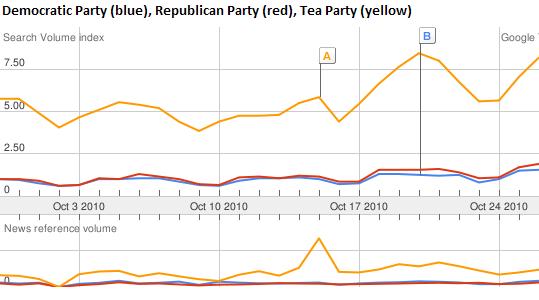
I thought it might be interesting to see whether or not there was anything I could tell about likely election outcomes from the volume of searches related to the Republican and Democratic parties. I did a comparison of the search volumes for “Republican Party”, “Democratic Party”, and “Tea Party” during October 2010, and looked at the same data for October 2008 (leading up to the last presidential election). Interestingly. the major party with the lead in October searches came out the winner in both cases. The Tea Party search volume needs to be explained though – if the voting followed the search volume completely, then we’d all be speaking Tea Party-ese now.
October 2010: More searches for “Republican Party” (the red line) than for “Democratic Party” (the blue line)
October 2008: More searches for “Democratic Party” (the blue line) than for “Republican Party” (the red line)
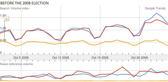
I KNOW, ELECTIONS ARE ACTUALLY MORE COMPLICATED THAN THAT
One glaring weakness of my half-hour exploration into election forecasting is that it is hard to imagine prospective voters searching mainly using party names. It is far more likely that candidates’ names and words relating to major issues would be the search terms of interest for predicting election outcomes. That, however, is more work than I would do for a blog post. I encourage anyone reading this to take up the gauntlet and pursue the more detailed view. Let me know how that comes out!
WHAT ABOUT THE YELLOW LINE?
Another factor that would have to be dealt with in building a real live election forecasting tool using search data would be the curiosity factor. People don’t just use search engines to research their voting interests – they also use them to satisfy their curiosity about topics (and political parties) that are currently in the public eye. That complicates the forecasting problem a bit. How can you tell idle curiosity from actual voting interest? I will have to mull that over…
Tags: Election Forecasts, elections, Google, Google Trends, politics, search, search data and elections